

How to Combine Fabric Colors and Trim Patterns Like a Professional Designer
Combining fabric colors and trim patterns is one of the most important skills in interior design. When done correctly, it can transform a plain space into a polished, designer-level interior. When done poorly, it can feel overwhelming, mismatched, or unfinished.
Professional designers follow clear principles when selecting fabrics and trims. These rules are not about limiting creativity. Instead, they provide a structure that makes design choices easier, more confident, and visually balanced.
In this guide, you will learn how to combine fabric colors and trim patterns like a professional designer—step by step. Whether you are decorating curtains, upholstery, pillows, or custom drapery, this article will help you achieve a cohesive, high-end look with ease.
Why Fabric and Trim Pairing Matters in Interior Design
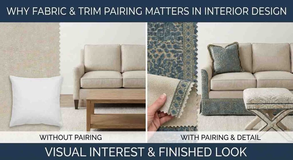
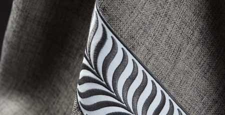
Fabric sets the tone of a space. Trim defines the details.
When these two elements work together, they add depth, contrast, and refinement. Trim is often the finishing touch that elevates a design from ordinary to custom.
Professional designers use trim to:
- Frame curtains and drapery
- Add contrast to solid fabrics
- Introduce subtle patterns
- Highlight architectural features
- Create visual balance
The key is understanding how color, scale, texture, and pattern interact.
Start With a Clear Design Vision
Before choosing fabrics or trims, professionals define the overall design direction.
Ask yourself:
- Is the space modern, traditional, or transitional?
- Do you want a calm, neutral look or a bold statement?
- Will the fabric be the main feature or a background element?
Your answers will guide every choice that follows.
A clear vision prevents over-mixing and helps you select trims that enhance rather than compete with your fabric.
Understand the Color Wheel Before Mixing Fabrics
Professional designers rely on the color wheel to create harmony.
The Three Most Designer-Approved Color Strategies
1. Monochromatic Color Schemes
This uses different shades of the same color.
Example:
- Cream fabric with ivory trim
- Navy fabric with a slightly lighter blue trim
This approach is elegant, safe, and timeless.
2. Analogous Color Schemes
These use colors that sit next to each other on the color wheel.
Example:
- Beige fabric with soft brown trim
- Blue fabric with green-toned trim
Analogous combinations feel natural and balanced.
3. Complementary Color Schemes
These pair opposite colors for contrast.
Example:
- Navy fabric with warm gold trim
- White fabric with black trim
This method creates drama and definition when used carefully.
Choose Fabric First, Trim Second
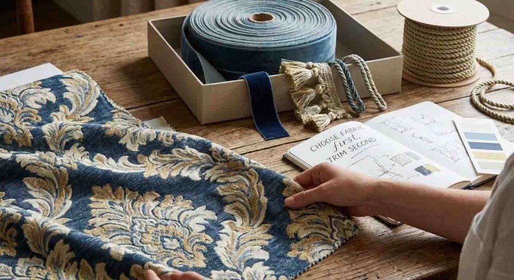
One of the biggest professional rules is simple:
Always choose your fabric before selecting trim.
Fabric covers the largest visual area. Trim supports it.
If you choose trim first, you limit your fabric options and risk imbalance. Designers treat trim as an accent, not the main focus.
Once the fabric is chosen, the trim should either:
- Match a color already in the fabric
- Provide controlled contrast
- Highlight the fabric’s texture or weave
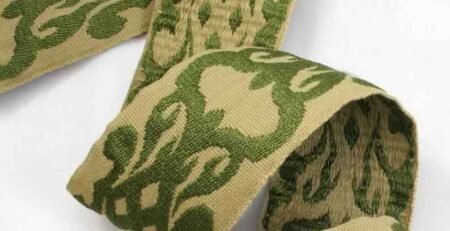
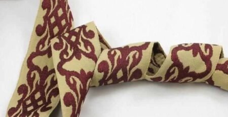
Match Trim Scale to Fabric Scale
Scale refers to the size of patterns and visual weight.
Professional Rule of Scale
- Large-scale fabric → simple or narrow trim
- Small-scale fabric → bolder or wider trim
- Solid fabric → patterned trim
For example:
- A busy floral fabric pairs best with a clean tape trim
- A solid linen fabric can handle a bold Greek key trim
- A subtle textured fabric works well with woven or jacquard trims
Matching scale keeps the design balanced and intentional.
Balance Patterns Without Overcrowding
Professional designers avoid visual clutter by limiting patterns.
A safe formula is:
- One main pattern
- One supporting pattern
- One solid or texture
If your fabric has a strong pattern, your trim should be simple.
If your fabric is solid, the trim can introduce interest.
Avoid pairing two loud patterns unless one is significantly smaller or more subtle.
Use Neutral Fabrics as a Design Anchor
Neutral fabrics are a designer’s secret weapon.
Colors like:
- White
- Cream
- Beige
- Gray
- Soft taupe
These shades allow trims to shine without overwhelming the space.
A neutral base with a patterned trim looks refined and flexible. It also makes future updates easier.
Designers often use neutral fabrics for curtains and introduce personality through trim color and pattern.
Let Texture Do Some of the Work
Professional design is not only about color and pattern. Texture matters just as much.
Textured fabrics such as:
- Linen
- Chenille
- Velvet
- Jacquard
These add depth even when colors are simple.
When working with textured fabric:
- Choose trims with subtle weave or soft sheen
- Avoid overly glossy trims unless the fabric is smooth
- Match the visual weight of the fabric and trim
Texture layering creates richness without complexity.
Use Trim to Define Edges and Shape
Trim is often used to frame fabric elements.
Professional designers place trim:
- Along curtain edges
- At the leading edge of drapery
- On pillow seams
- At upholstery borders
This framing effect makes custom pieces feel tailored and high-end.
For curtains, vertical trim placement draws the eye upward, making ceilings feel taller.
Stick to a Consistent Color Story
A common professional technique is repeating colors throughout a room.
If your trim includes black and white:
- Echo those colors in pillows
- Repeat them in artwork
- Use them in small accessories
This repetition creates flow and cohesion.
A color should appear at least twice in a room to feel intentional.
Avoid Over-Matching
Perfect matching looks flat.
Professional designers prefer coordination, not duplication.
Instead of matching trim and fabric exactly:
- Choose tones within the same family
- Mix warm and cool versions of a color
- Use contrast to add dimension
Slight variation creates visual interest and sophistication.
Understand Warm vs Cool Undertones
Two fabrics can look similar but clash due to undertones.
Warm undertones:
- Cream
- Beige
- Gold
- Warm gray
Cool undertones:
- Crisp white
- Blue-gray
- Silver
- Charcoal
Professionals always match undertones before matching colors.
Warm fabric with cool trim often looks off, even if the colors seem similar.
Test Combinations in Natural Light
Professional designers never rely on showroom lighting alone.
Before finalizing fabric and trim:
- Place samples together near windows
- View them in morning and evening light
- Check them under artificial lighting
Light changes color perception dramatically.
What looks perfect in one light can feel wrong in another.
Keep the Room’s Purpose in Mind
Designers choose fabric and trim based on how the space is used.
For high-traffic areas:
- Choose durable fabrics
- Avoid overly delicate trims
For formal spaces:
- Use richer textures
- Add decorative trims for elegance
For relaxed spaces:
- Keep trims minimal
- Focus on comfort and softness
Function always informs design choices.
Follow the 60-30-10 Design Rule
Professionals often use this classic rule.
- 60% dominant color (main fabric)
- 30% secondary color (supporting fabric or trim)
- 10% accent color (small trim details)
This formula keeps designs balanced and visually pleasing.
Mixing Multiple Trims the Right Way
Using more than one trim is possible, but it requires restraint.
Professional tips:
- Keep trims in the same color family
- Vary width instead of color
- Use one trim as primary, one as secondary
Avoid using multiple bold trims on the same piece.
Less is more.
Common Mistakes to Avoid
Even experienced decorators make mistakes. Professionals avoid these common issues:
- Choosing trim that competes with fabric
- Mixing too many patterns
- Ignoring undertones
- Using trims that are too wide for the fabric
- Forgetting the room’s overall palette
Awareness of these pitfalls helps maintain a polished look.
How Professionals Make Designs Feel Custom
Custom design is not about expensive materials. It is about thoughtful choices.
Professionals:
- Use trim to personalize standard fabrics
- Repeat colors subtly across the space
- Balance bold and quiet elements
- Let one element take the spotlight
This approach creates spaces that feel intentional and refined.
Final Thoughts: Designing With Confidence
Learning how to combine fabric colors and trim patterns like a professional designer is about understanding balance, not following strict rules.
When you:
- Start with fabric
- Respect scale and proportion
- Match undertones
- Limit patterns
- Use trim as an accent
You create interiors that feel cohesive, elegant, and timeless.
With practice, fabric and trim selection becomes intuitive. Each project builds confidence, and every space begins to tell a clear, beautiful story.
Professional design is not about perfection—it is about harmony.


Leave a Reply
You must be logged in to post a comment.